FRENCH NORMAN REVISITED
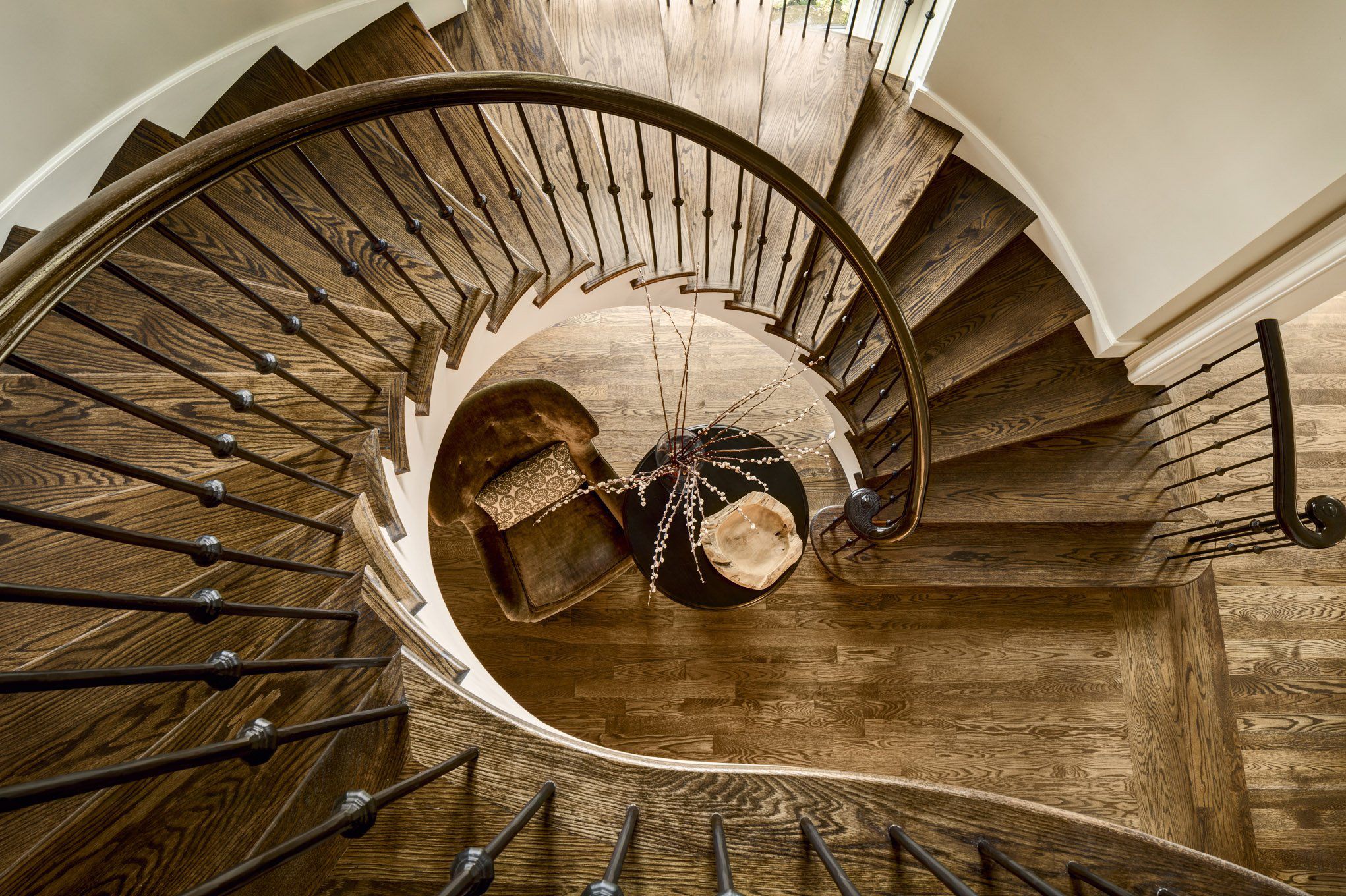
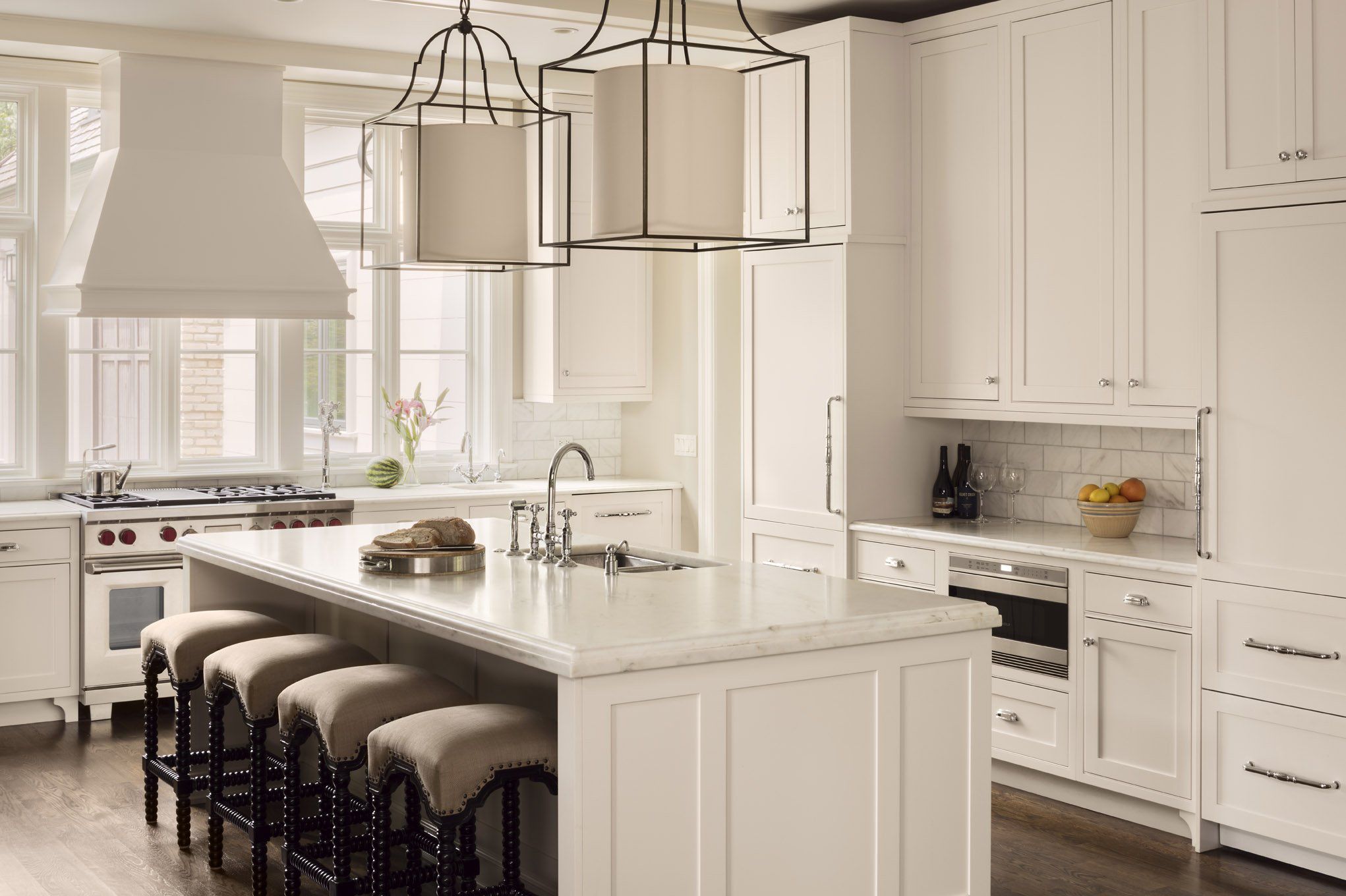
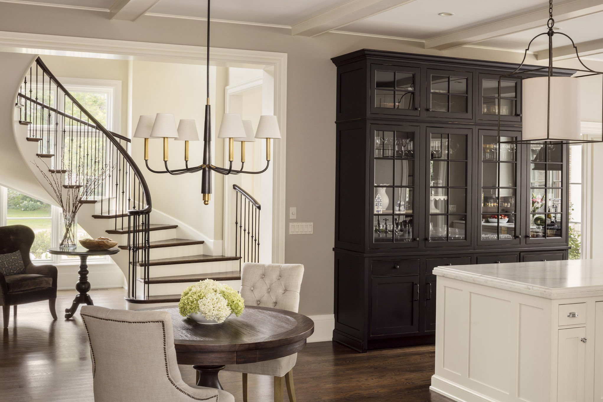
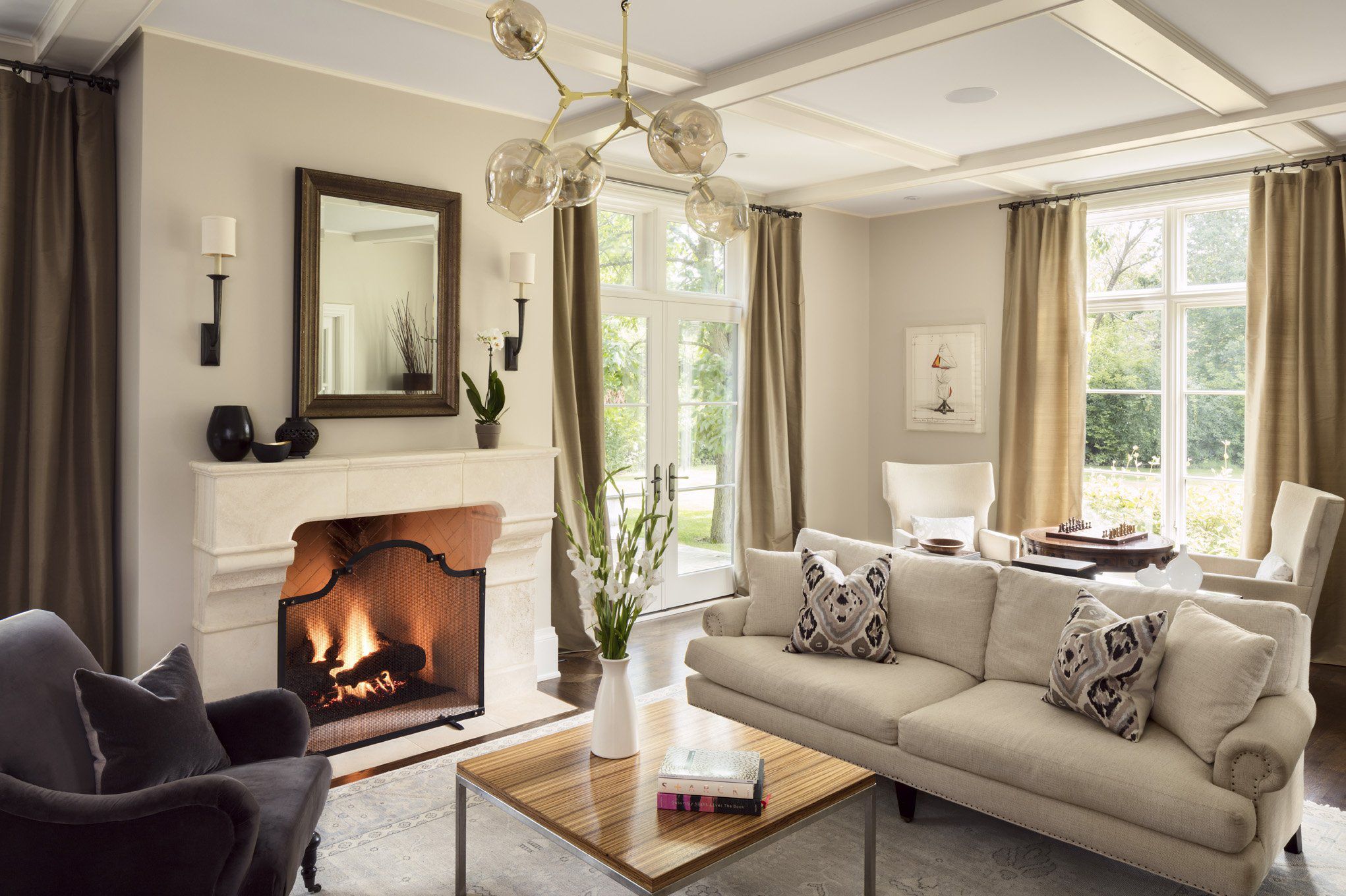
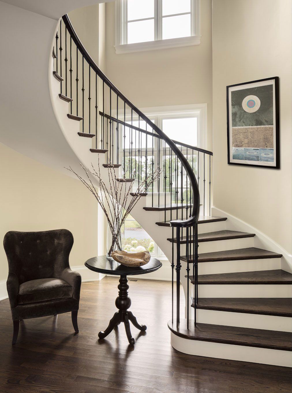
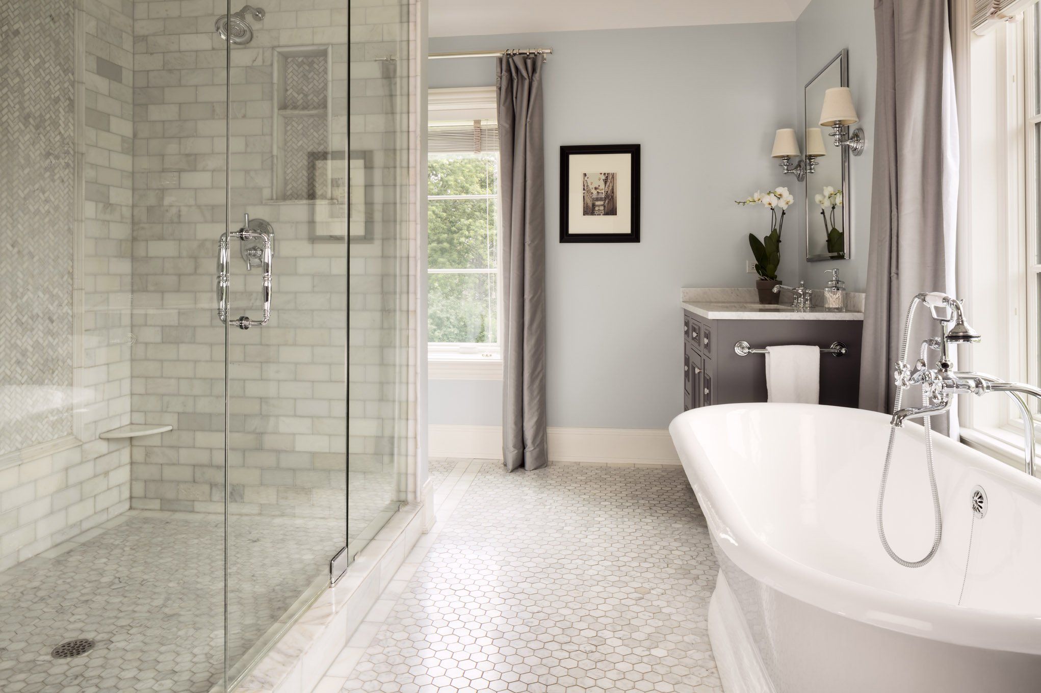
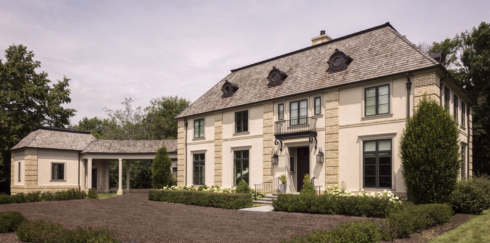
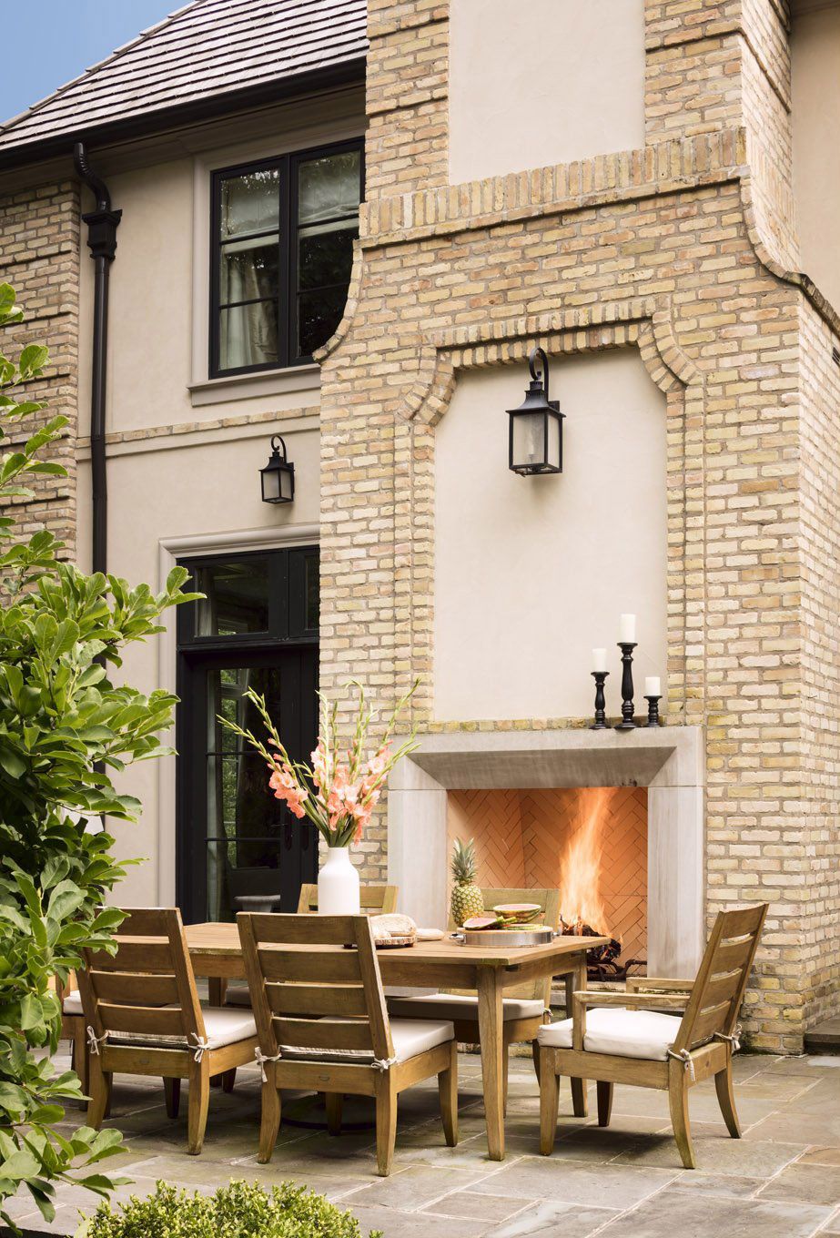
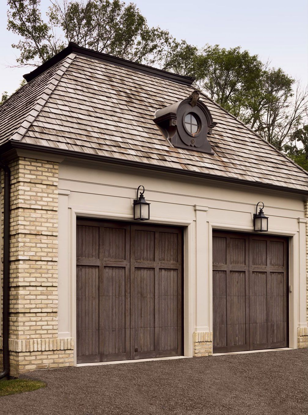
For this project, our client was looking to have a home designed that would exhibit classic lines and a historic feel, yet still be rigorous and bold enough that one wouldn’t know if it was a new home, or a 100-year-old renovated residence. They wanted something ‘airy and clean’ that would lend itself toward casual family living, but, when ‘dressed up,’ lend itself toward sophistication and a ‘design awareness.’
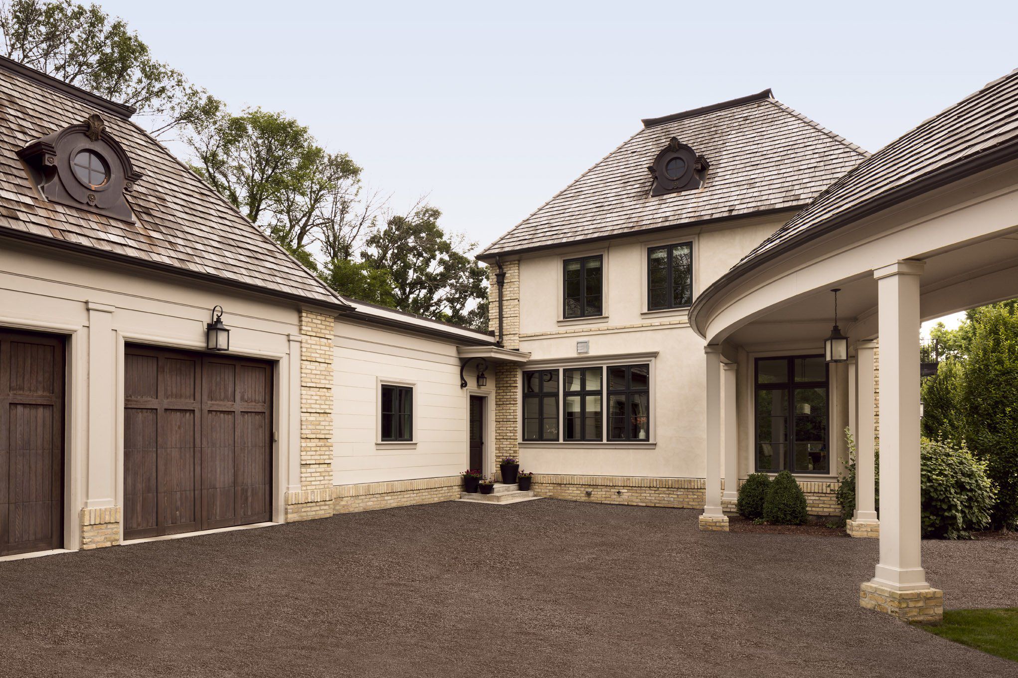
The initial approach to the site was, rather quaintly, off the corner of a cul-de-sac. Instead of orienting the home toward the street, we aligned it squarely on the property, allowing for a direct connection to the front door from the road. Such siting also made possible the creation of several exterior quadrants of land that would allow the client to maintain an appointed service area, a private outdoor living area, and allow for expansion possibilities, including the potential for a large garden and/or south-facing orchard.
We, along with the client, felt it was important to allow for extraordinary views from each of the main rooms, as well as for northern-facing rooms to benefit from the southern light. As such, we positioned the layout so that one would enter the house asymmetrically, with the central part of the home serving merely as circulation space. In this way, the floorplan is rather simple, in that guests move from room to room seamlessly, rather than by way of long corridors.
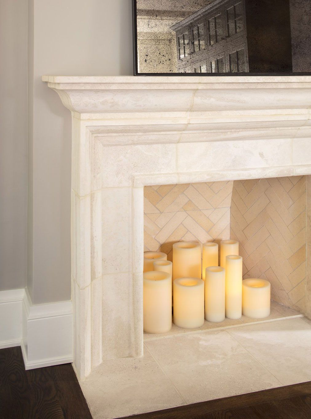
Buoyed by classic architectural detailing and a casual elegance, this beautiful residence serves as a place of nurturing and comfort for a growing family, all the while paying tribute to the luxury and sophistication of a bygone era.
Photography: David Bader


